Employment report

A lot better than expected, and markets reacting accordingly, and the narrative about the 1.2 million people losing benefits at year end ‘inflating’ the jobs number seems not material based on the numbers so far released:

Employment Situation


Highlights
The labor market improved in September for the most part. Job growth topped expectations, The unemployment rate declined. However, wage inflation is oscillating but remaining on a low trajectory.

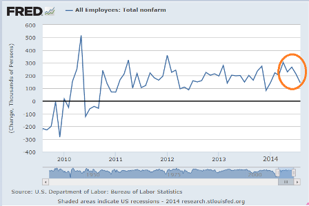
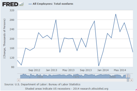
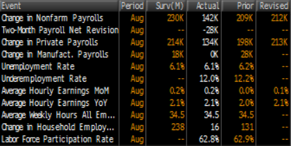
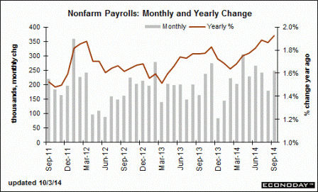
Nonfarm payroll jobs gained 248,000, after a 180,000 rise in August and 243,000 increase in July. Net revisions for July and August were up a sharp 69,000. The median market forecast for September was for a 215,000 gain.

The unemployment rate declined to 5.9 percent from 6.1 percent in August. Expectations were for 6.1 percent.

Going back to the payroll report, private payrolls advanced 236,000 in September after a 175,000 boost in August. Expectations were for 236,000.

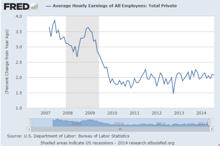
Average hourly earnings were unchanged in September after a 0.3 percent rise the month before. Average weekly hours ticked up to 34.6 hours versus 34.5 hours in August and expectations for 34.5 hours.

Overall, job growth improved while wage inflation remained soft. The Fed still has many options for policy.

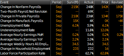
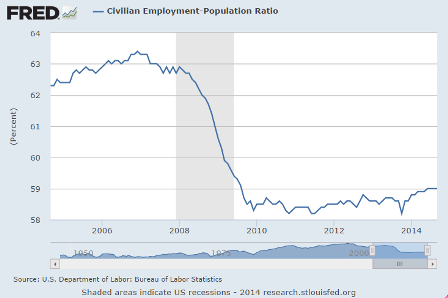
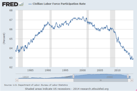
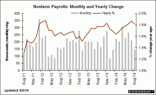
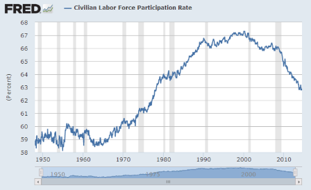
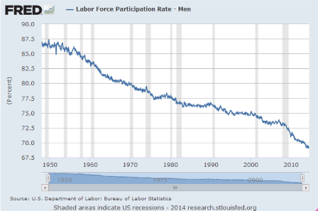
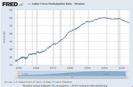
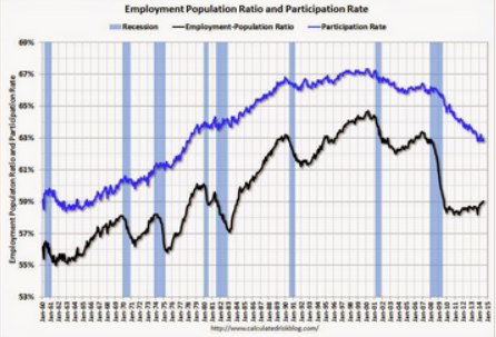
While there were more net new hires, seems the working age population went up quite a bit as well, as the % of the population working remained at relatively low 59% for the third month:

Preview of Friday’s employment report

The household survey has been in decline for several months, with lower highs and lower lows:

Same with the non farm payroll report:

Analysts are counting on Friday’s report showing August being revised up substantially and September payrolls to be up over 200,000.

Anything could happen, of course, but something less than that would be in line with the narrative about the 1.2 million who lost benefits at year end taking menial jobs best they could earlier this year, causing those prints to be higher than otherwise, etc.

Fed preview

The Fed’s mandates are full employment, price stability, and low long term rates. And along with who knows what, he has to be seeing these charts:

New jobs down for the winter, up some, then back down for several months:

Not forget purchase mortgage applications are down 12% vs last year, and now cash purchases are down as well, as housing contributes less than half of what’s it’s contributed in prior cycles.

And the rest of the world economy is decelerating as well.

Fed’s consumer survey, employment slips as suspected

This implies we need a larger deficit than otherwise to close the output gap/sustain full employment, has higher income earners tend to generate more unspent income/more savings than lower income earners.

Looks to me like the “1.2 million who lost benefits at year and took menial jobs” narrative has run its course, and consequently H2 employment gains will be that much weaker than H1, as suggested earlier…
;)

Charts on labor force participation rates- not good!

Hard to believe there isn’t a lot of slack indicated here.

Note that it’s always gone up during an expansion, until now:


Full size image

And isolating the ‘prime working age’ removes the ‘aging factor’


Full size image


Full size image

In fact, the chart for ‘over 55’ shows the overall drop in participation didn’t come from this group, and, seems, their participation would have gone up in a ‘normal’ recovery:


Full size image

And who would have thought a weak demand would hurt these groups first/hardest…
Certainly not in America…


Full size image

And, while down dramatically, look how high this has been and still is:


Full size image


Full size image

But maybe the clue to why the subject is getting all the attention this time around lies here?

Just saying…


Full size image

For all men the rate’s been falling for a long time, with the recent drop less noticeable.

And it used to be over 85%!


Full size image

Add this and you have the appearance that (lower cost?) women have been replacing (higher cost?) men for a long time now?


Full size image

Enough to make the point.

Unlike all prior recoveries, this recovery continues to fail to keep up with population and productivity growth

Which is the evidence that the federal budget deficit is far to low for current financial condition.

That is, the output gap remains extreme and, if anything, is growing, as out government continues to fail its electorate.

US jobs rose since ’08 crisis, but pay is 23% less

US jobs rose since ’08 crisis, but pay is 23% less: report

Aug 11 (Reuters) — Jobs growth in the U.S. since the 2008 recession has been undermined by lower wages, with workers earning an average 23 percent less than earnings from jobs which were lost, a report by an organization representing U.S. cities said on Monday.

The average annual salary in sectors where jobs were lost – particularly manufacturing and construction – during the 2008-9 financial crisis was $61,637, according to the report by the United States Conference of Mayors (USCM), which represents cities with populations of more than 30,000.

Job gains through the second quarter of 2014 in comparative sectors showed average wages of $47,171, implying $93 billion in lower wage income, the report said.

The report also showed that the majority of metro areas – 73 percent – had households earning salaries of less than $35,000 a year.

The latest monthly employment data from the Labor Department showed that more than 200,000 jobs were created for the sixth straight month in July, but that wages were about flat in the private sector.

American workers, on average, earned $24.45 an hour in July, up only a penny from June. Over the last year, wages have grown just 2 percent, in keeping with where they have been stuck since late 2009.

Kudlow on year end benefit expiration driving H1 employment gains

The question is whether this front loaded 2014 hiring.

If it did, H2 employment gains could be materially lower.

Kudlow: Jobs are the best kind of welfare

“To be sure, there are signs that employment in the country is rising more rapidly these days. The February to July period was the first six-month stretch of consistent employment gains above 200,000 since 1997. And that came without any new programs from the federal government to “create jobs.” Even more surprising, those gains overlapped a quarter in which GDP actually contracted.

So what drove the increase? University of Chicago professor Casey Mulligan put his finger on it: “Major subsidies and regulations intended to help the poor and unemployed . . . reduce incentives for people to work and for businesses to hire.” And guess what happened when federal emergency job assistance ended? Job increases were the best in 17 years.”

Recent charts

If you haven’t donated to the PMC yet you can do so here.

I just finished the 2 day ride. :)

100% of all donations go to Dana Farber in Boston, THE premier cancer research center.

And I’m in the process of narrowing this mailing list to those who donate.

;)

Notice that the govt deficit and savings rate more pretty much together?

Car sales off of last months pace, but forecasts for this year are for a slower rate of growth than last year:


Full size image

No sign of ‘consumer acceleration’ here?


Full size image

Manufacturing continues chugging along at it’s usual 4% rate of growth:

PMI Manufacturing Index:


Full size image

And Consumer Sentiment continues to bob around at levels that were the pretty much the lows of prior cycles:


Full size image

Slipping a bit after the year end surge to beat expiring tax credits?

Bank lending flattening some after growing to fund unsold Q2 inventories?

Q2 could be revised to anything over the next couple of months, seems, as was Q1.

But at least for now the chart is what it is:


Highlights
The second quarter rebounded more than expected from the adverse weather impacted first quarter. While there were a number of strong components, the rebound was led by inventory growth.