
Hard to believe there isn’t a lot of slack indicated here.
Note that it’s always gone up during an expansion, until now:
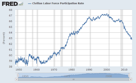
Full size image
And isolating the ‘prime working age’ removes the ‘aging factor’
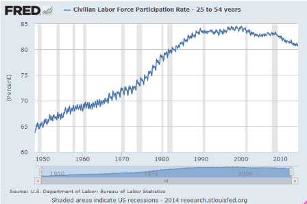
Full size image
Full size image
In fact, the chart for ‘over 55’ shows the overall drop in participation didn’t come from this group, and, seems, their participation would have gone up in a ‘normal’ recovery:
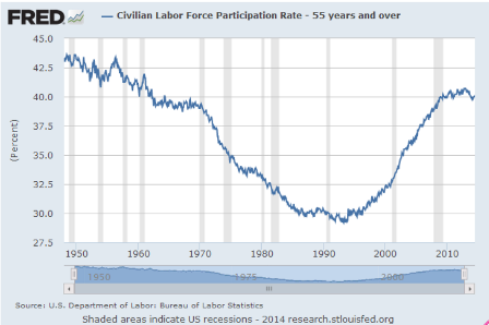
Full size image
And who would have thought a weak demand would hurt these groups first/hardest…
Certainly not in America…
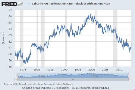
Full size image
And, while down dramatically, look how high this has been and still is:
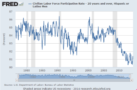
Full size image
Full size image
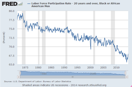
But maybe the clue to why the subject is getting all the attention this time around lies here?
Just saying…
Full size image
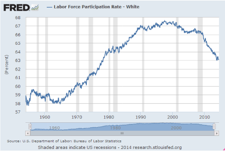
For all men the rate’s been falling for a long time, with the recent drop less noticeable.
And it used to be over 85%!
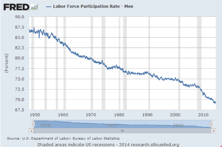
Full size image
Add this and you have the appearance that (lower cost?) women have been replacing (higher cost?) men for a long time now?
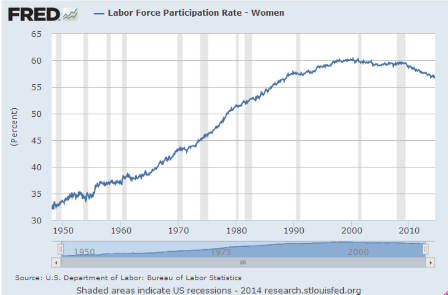
Full size image
Enough to make the point.
Unlike all prior recoveries, this recovery continues to fail to keep up with population and productivity growth
Which is the evidence that the federal budget deficit is far to low for current financial condition.
That is, the output gap remains extreme and, if anything, is growing, as out government continues to fail its electorate.