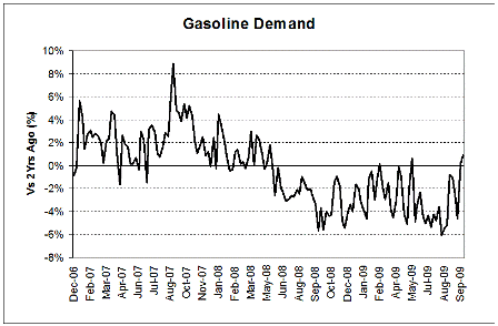
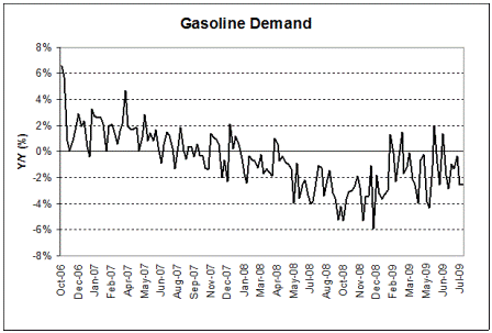
This is more interesting than the year over year chart, as last year had quite a few shocks in it.
We went from growing demand a couple of years ago to falling/flat demand currently.
The rest of the Valance charts show much the same.
After a large fall it generally looks like it has flattened out, but no sign of a general recovery.
And a lot of indicators are still falling.
Personal income, for example is still falling by a few tenths year over year.
And core CPI is in a nose dive.
The difference this time around may be the zero rates lingering around long enough take effect.
Might be that with 0 rates we need a lot lower taxes for a given amount of gov spending than otherwise.
No harm in leading with a payroll tax holiday, per capita revenue sharing for the states, and a federally funded $8/hr job
for anyone willing and able to work that includes health care.
(I’m out for a few days joining Karim in DC for meetings.)
[top]


