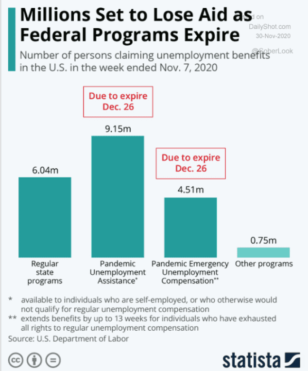
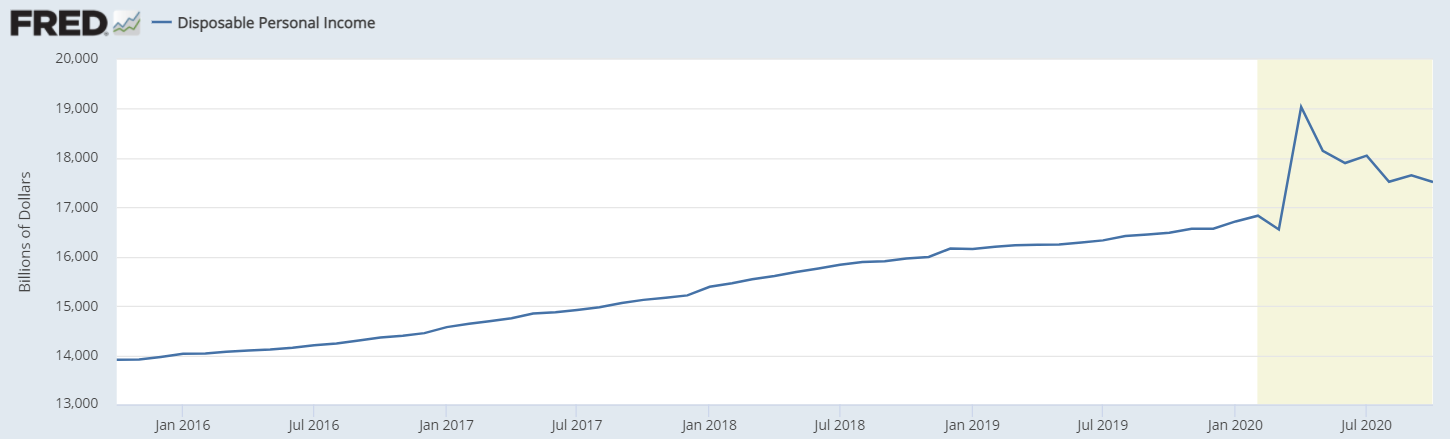
Stubbornly way high and rising some:
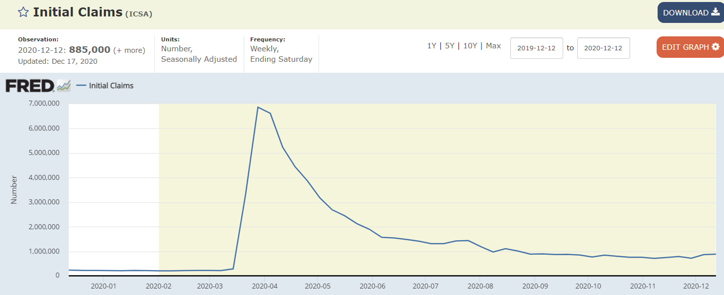
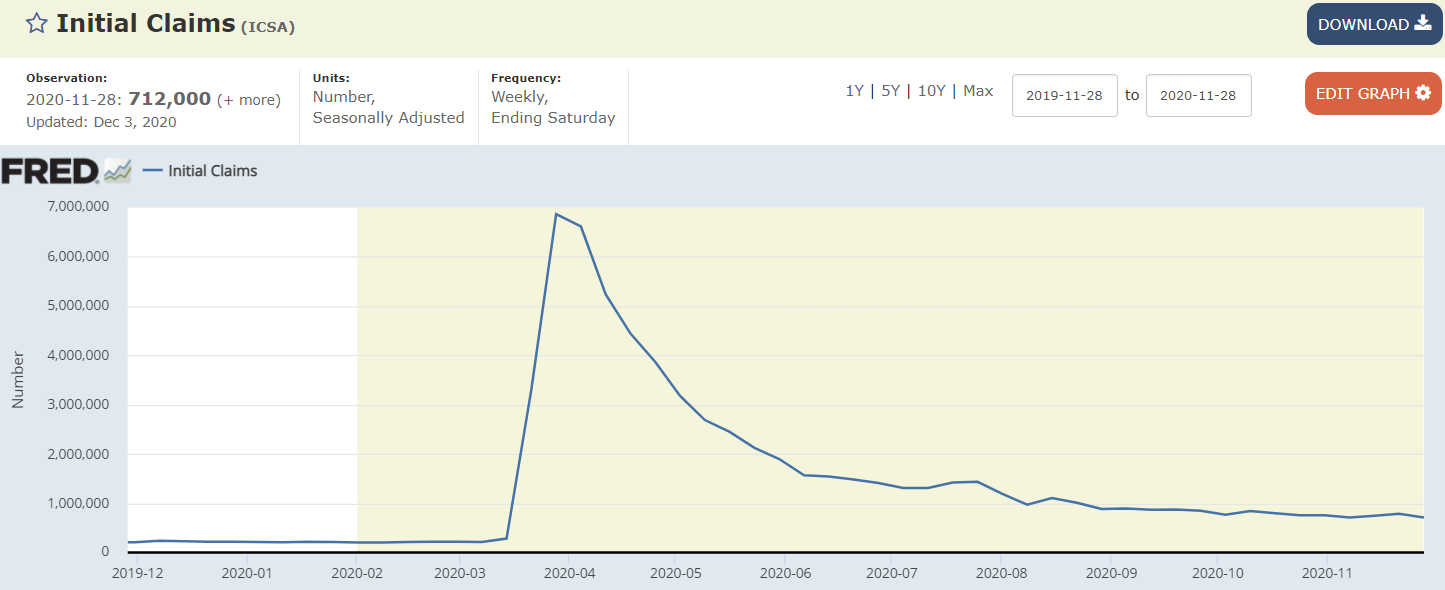
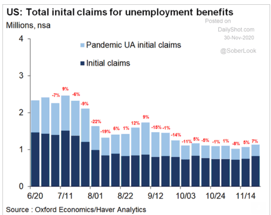
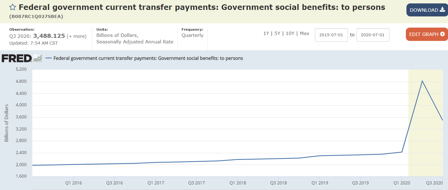
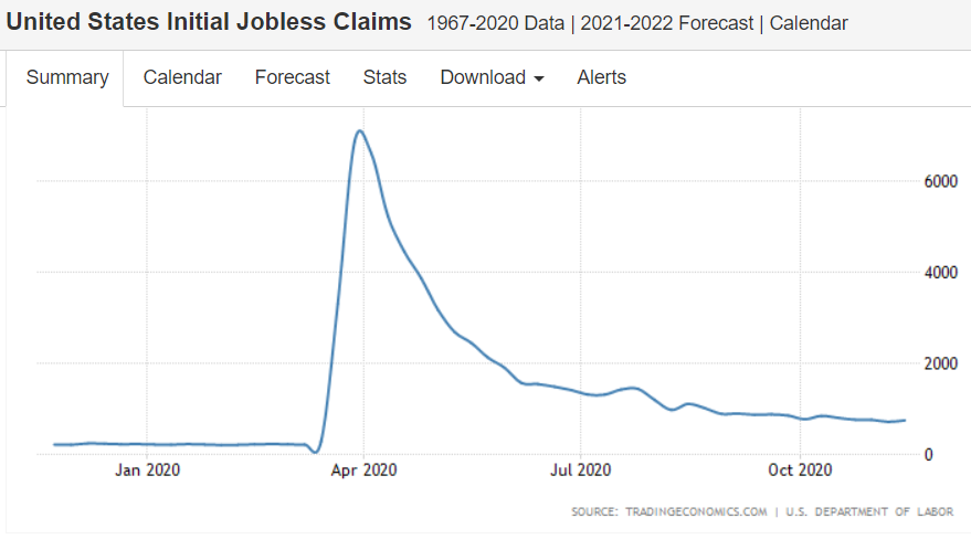
Very high and coming down only as they expire:
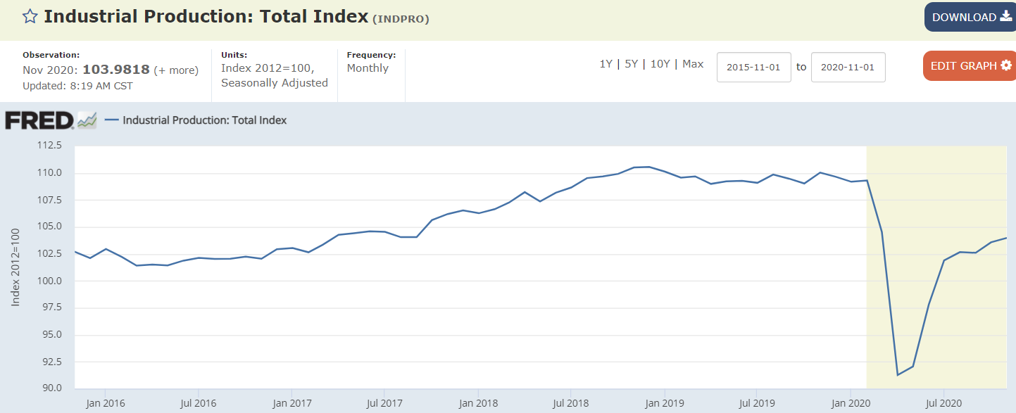
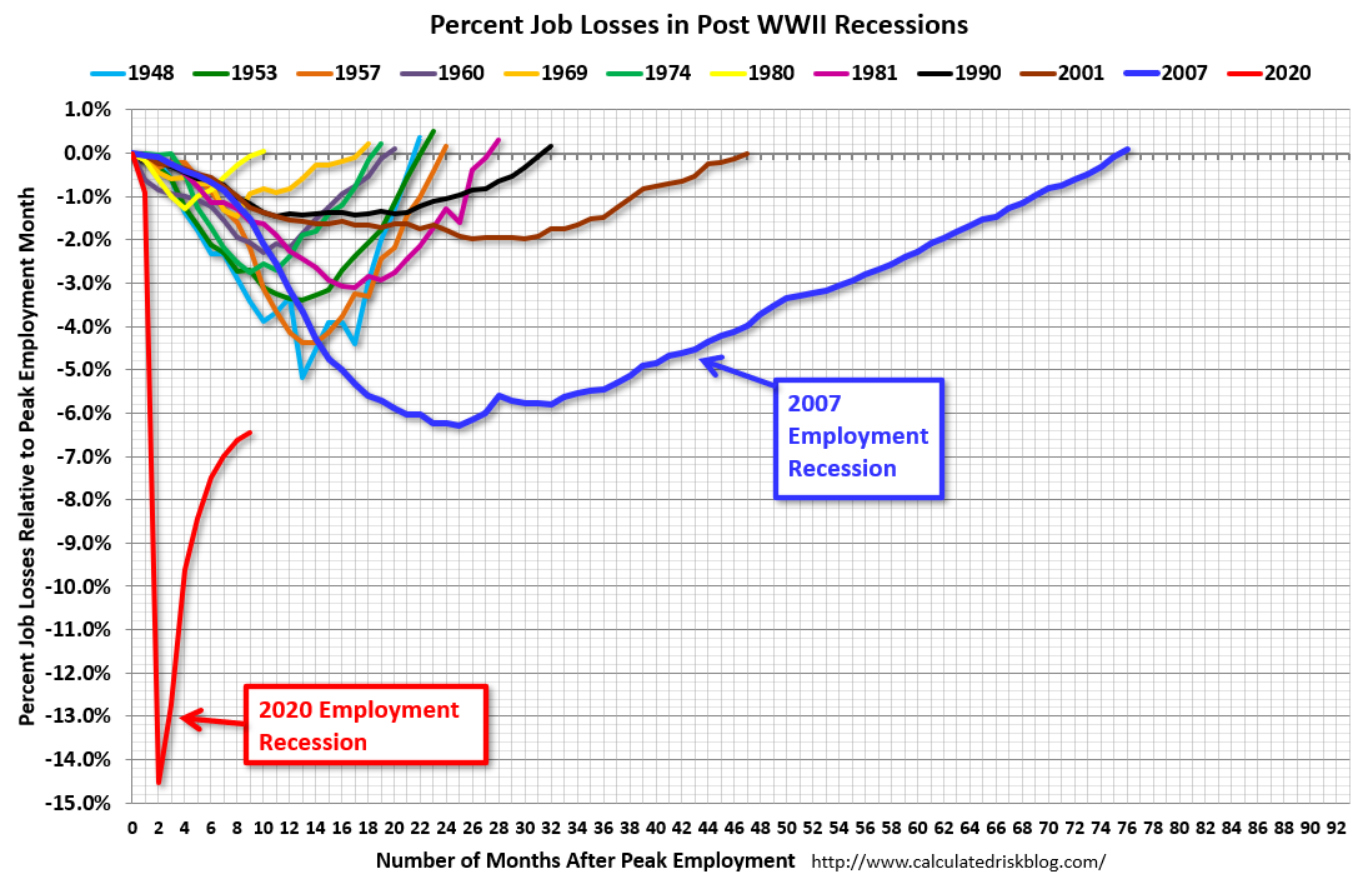
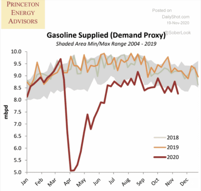
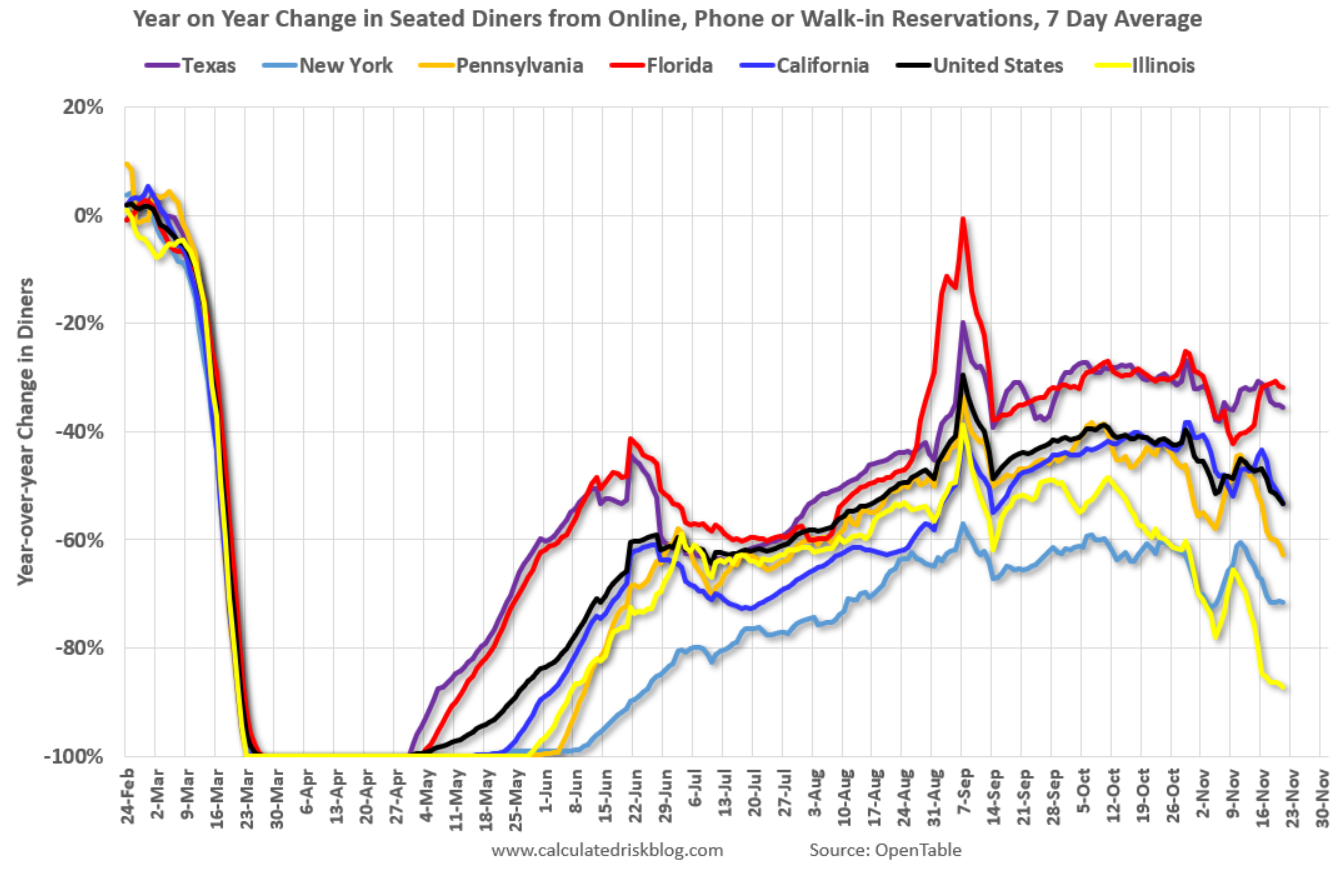
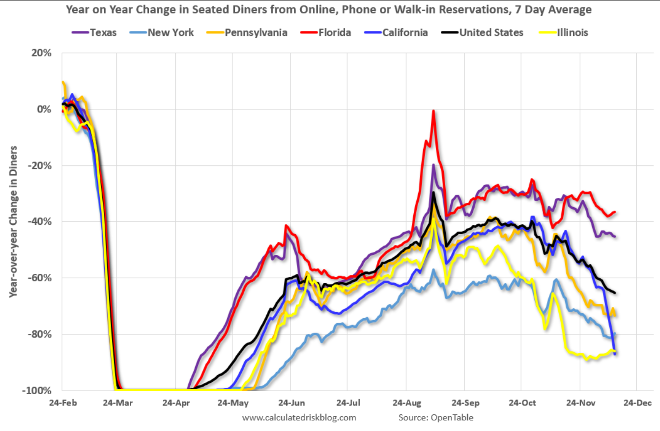
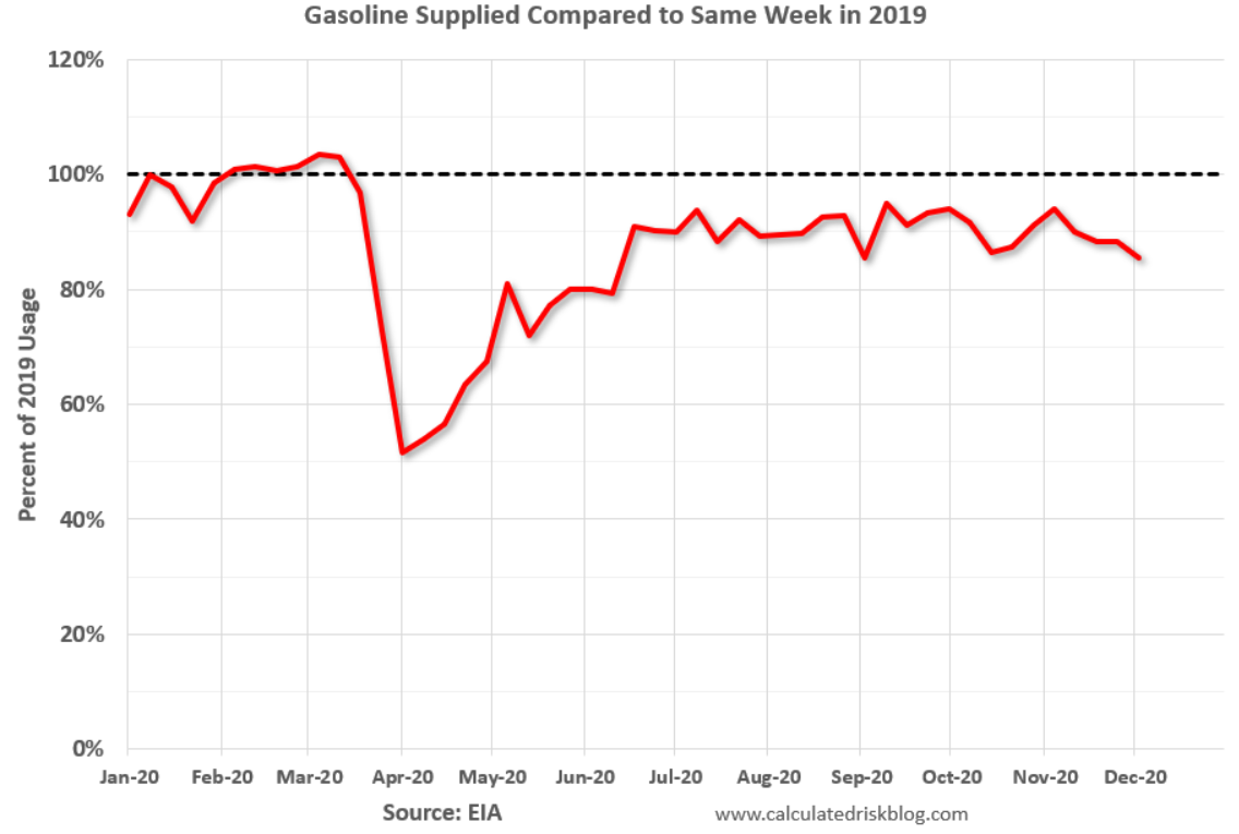
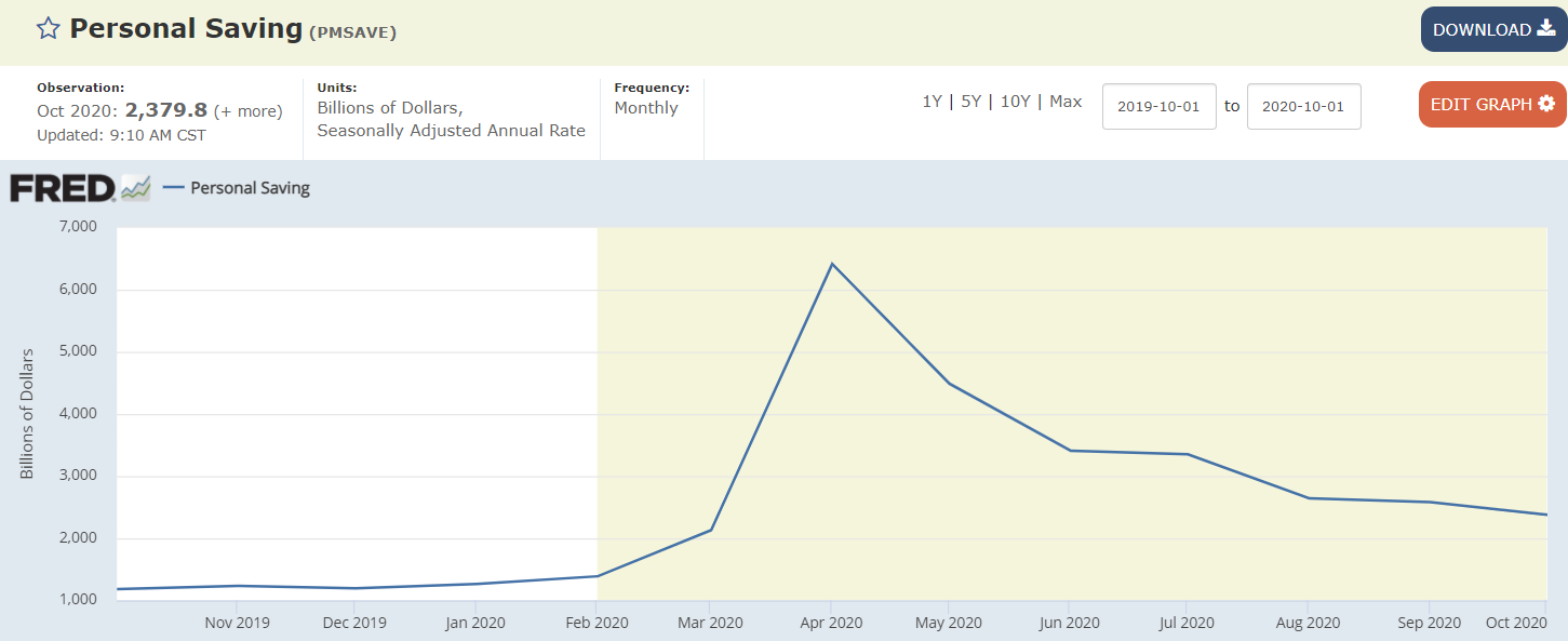
Familiar dip and partial recovery pattern:

Stubbornly way high and rising some:
Very high and coming down only as they expire:
Familiar dip and partial recovery pattern:
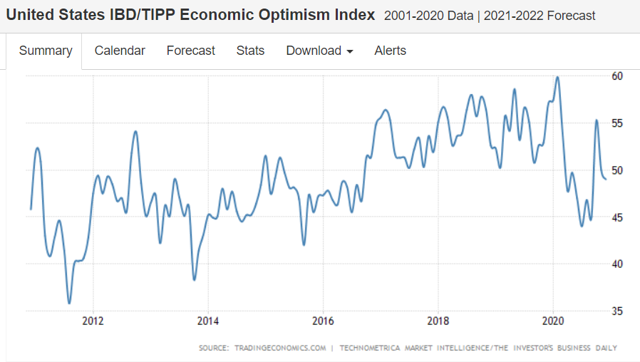
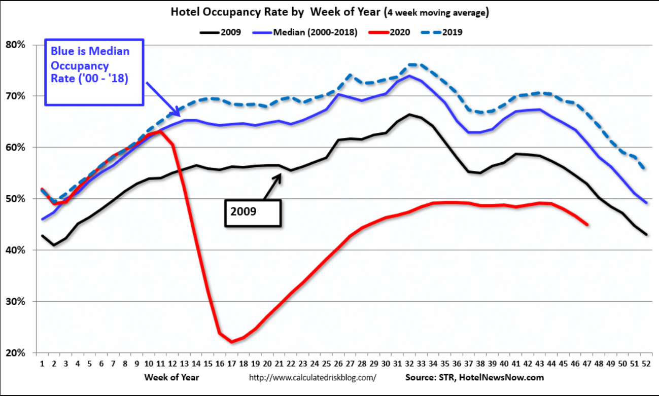
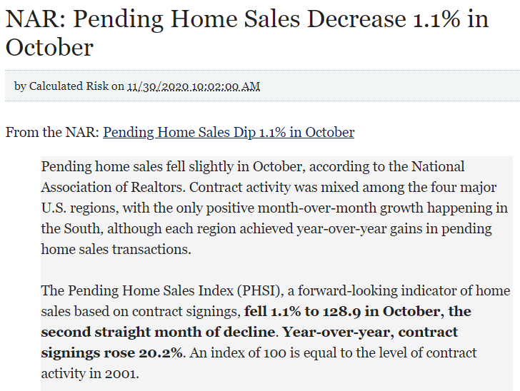
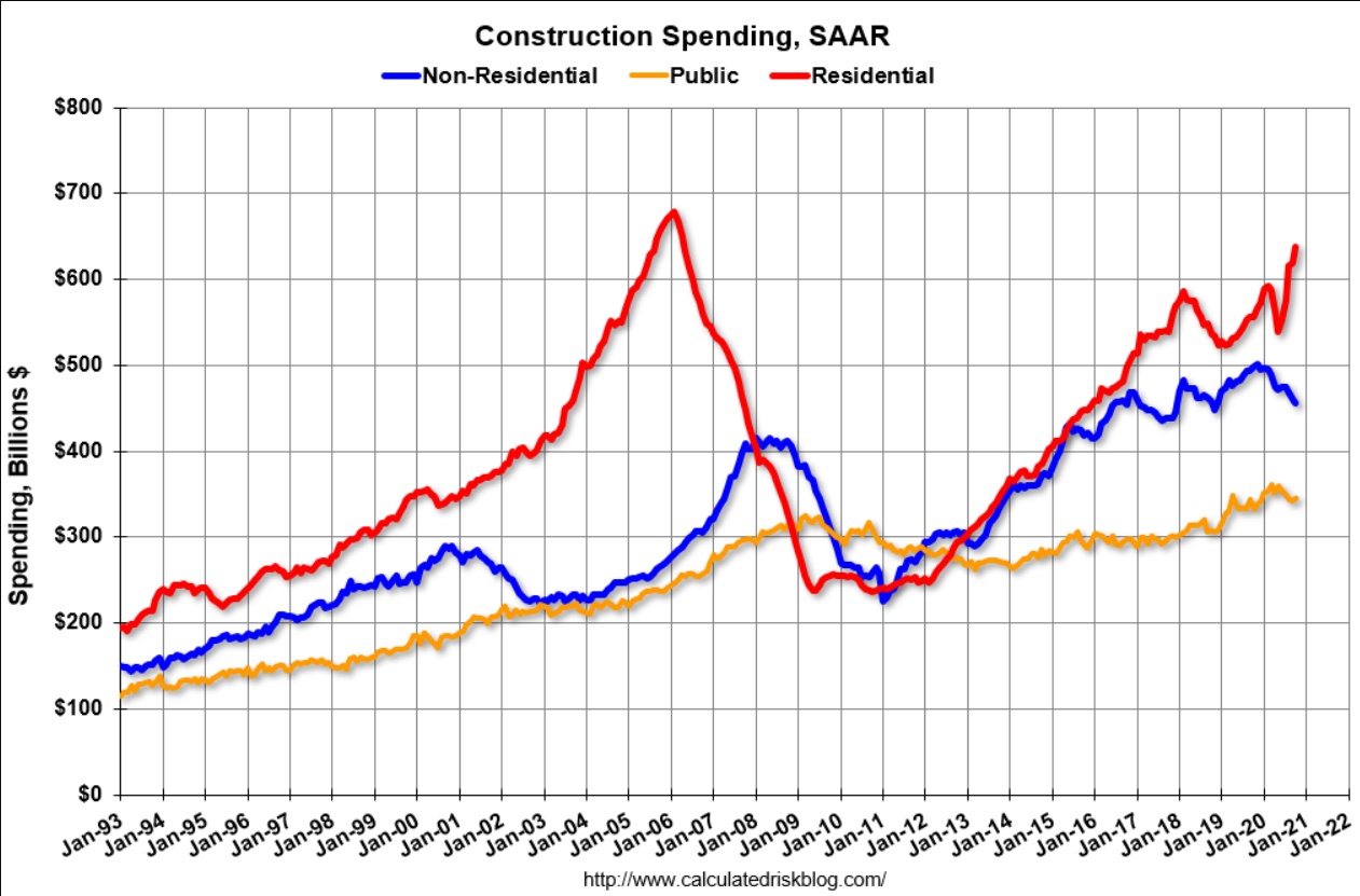
Some housing indicators may be looking up but not this one:
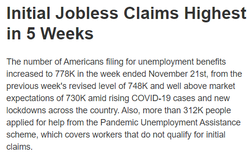
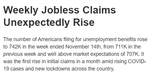
Other indicators sagging as well as the economy starts to go over the fiscal cliff as benefits expire:
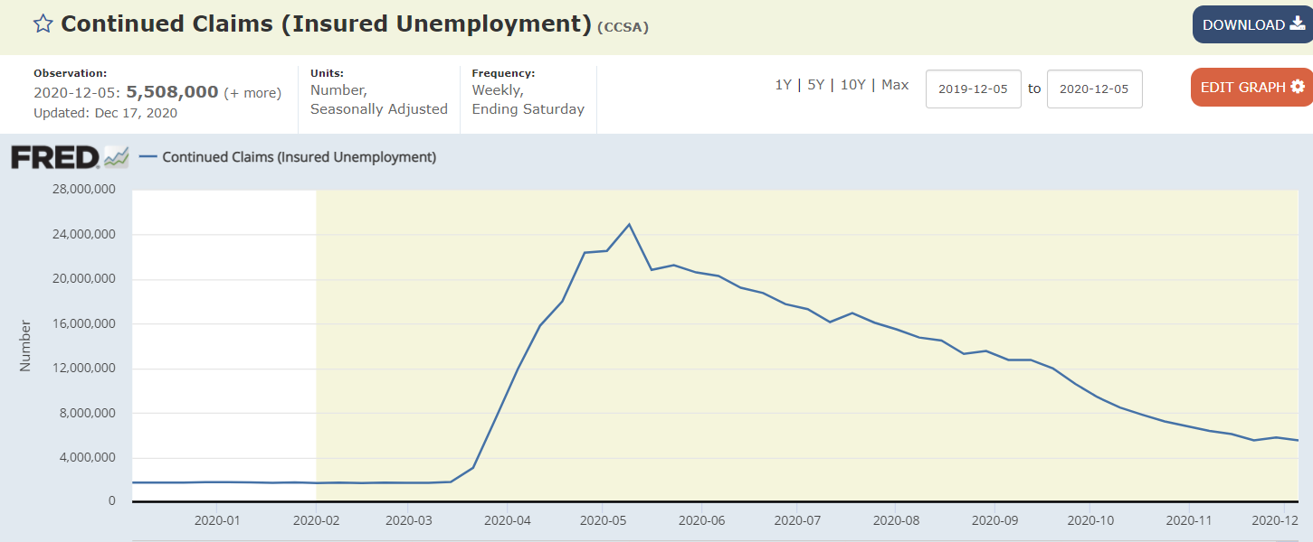
These continue at extraordinarily high levels:
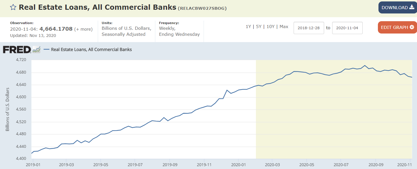
Still working its way lower, and never has had much of a recovery since the 2008 collapse. This chart isn’t inflation adjusted, so it’s that much worse than it looks:
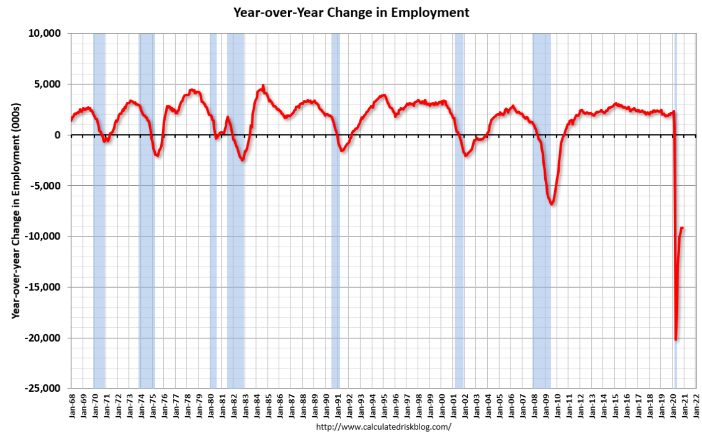
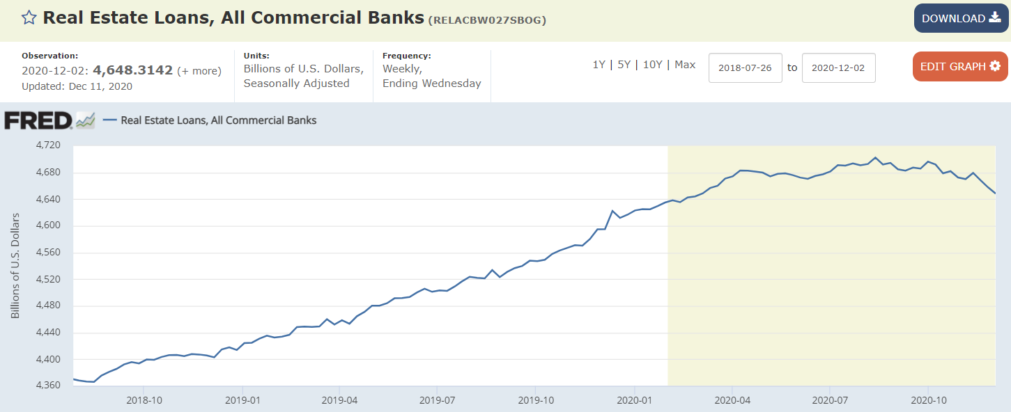
Still climbing. This is not good:
This is bad too:
Working it’s way lower as benefits expire and employment growth sags:
Savings added by fiscal adjustments are running down:
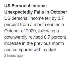
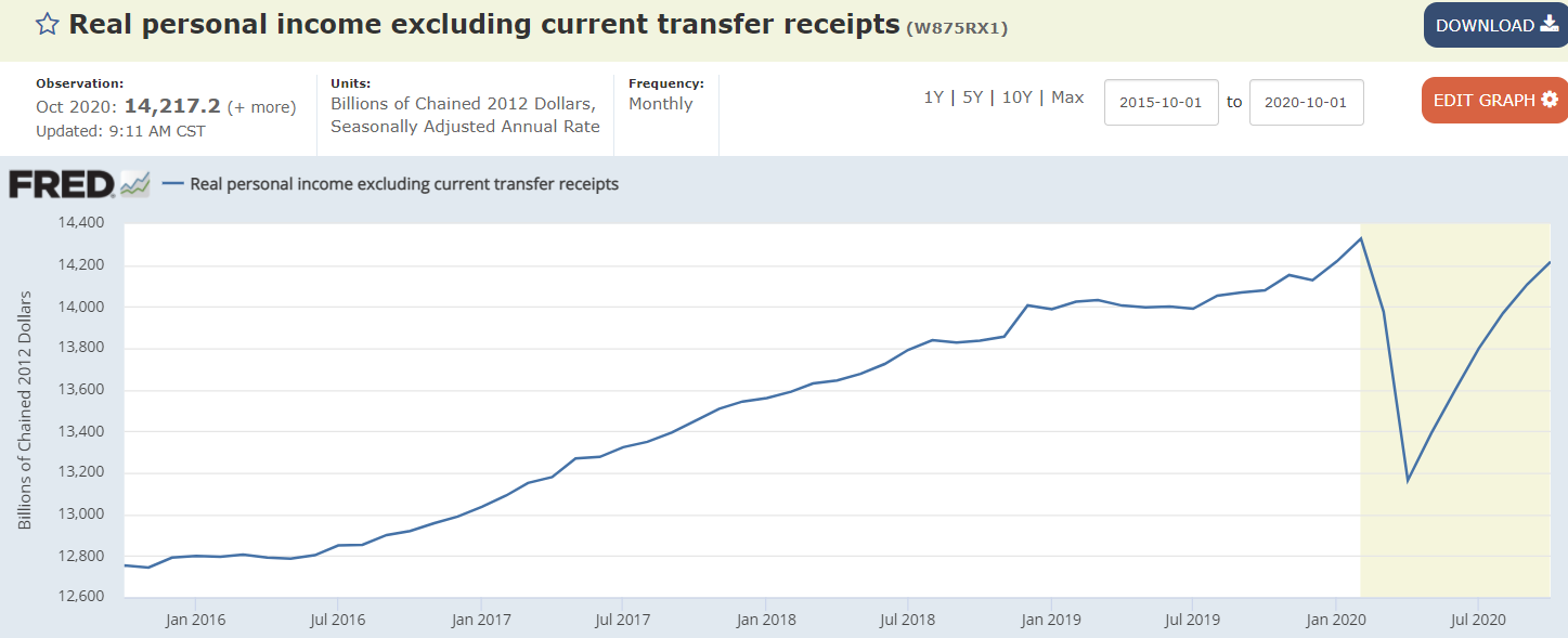
The economy has generated a lot less personal income than it would have generated without the covid crisis:
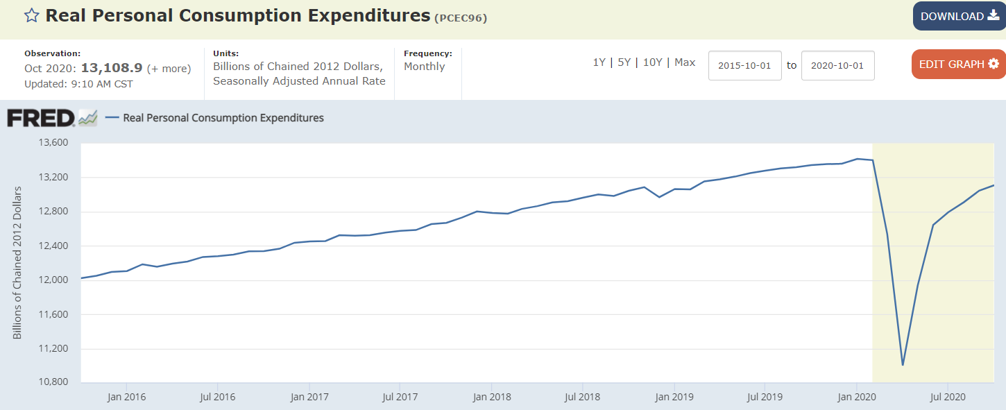
Same with consumption, which is about 70% of gdp:
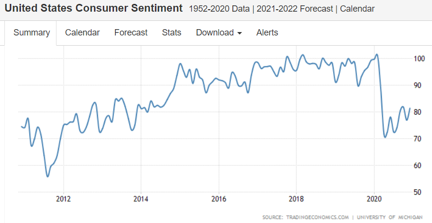
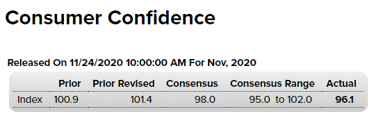
Fading:
Fading:
Still extremely high and now going higher:
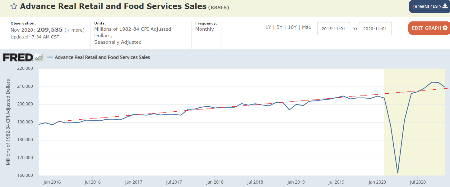
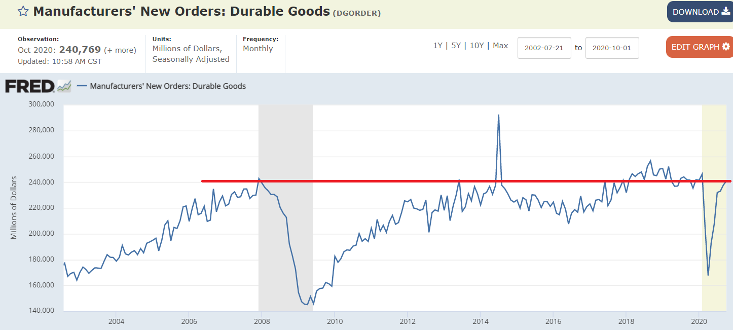
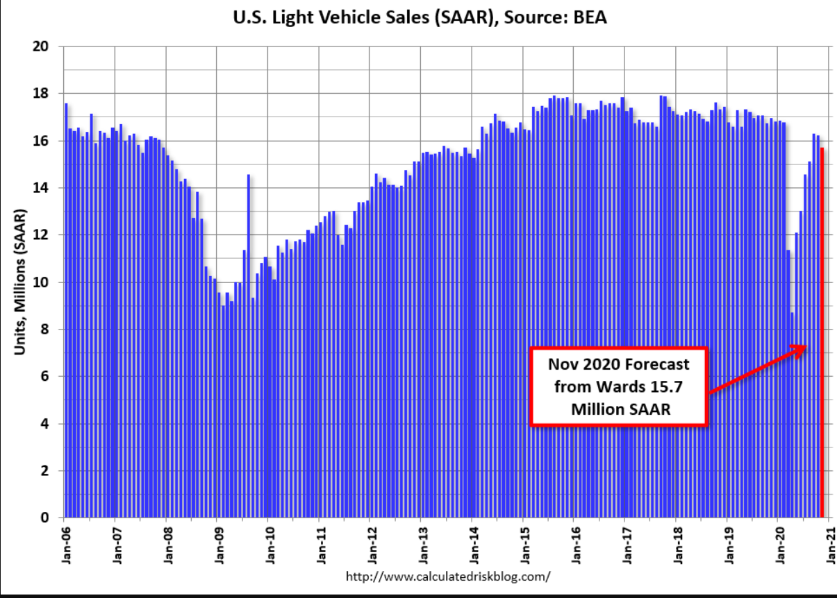
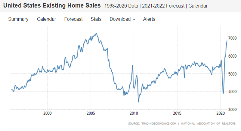
The large dip in sales was followed by a recovery, so the total sales over that time are about on track:
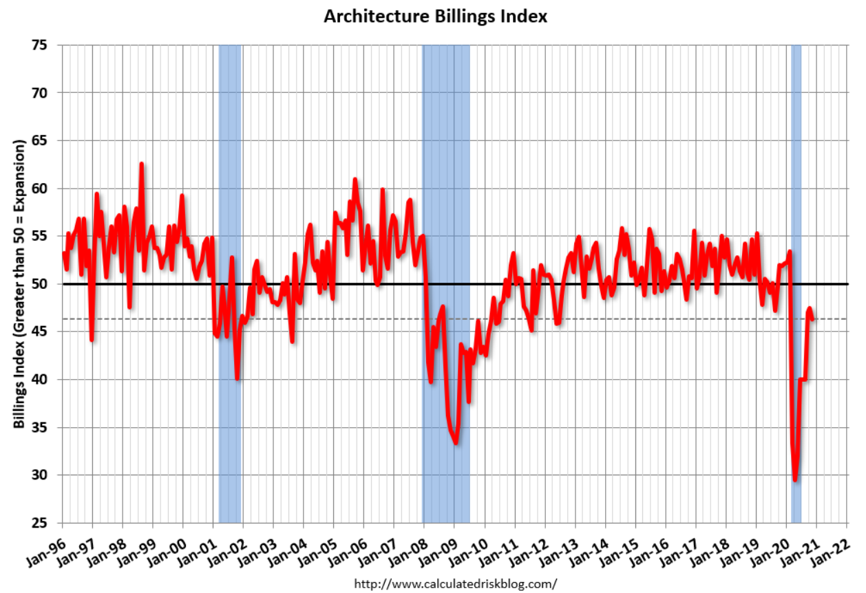
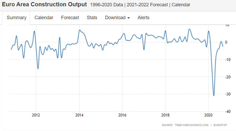
Back into contraction:
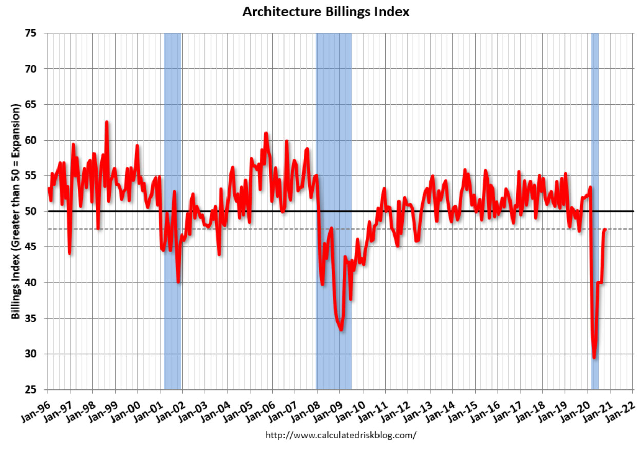
Still in contraction:
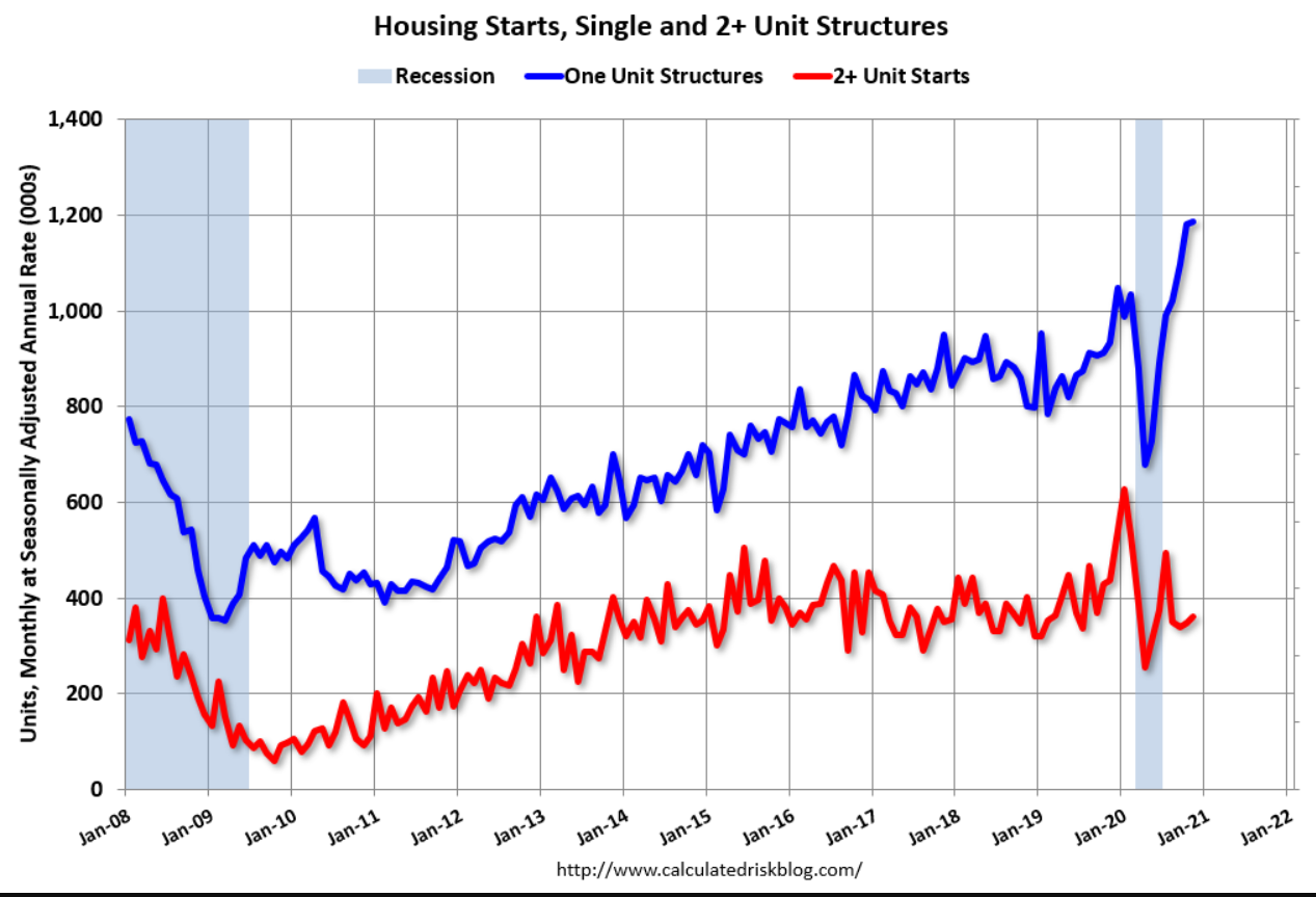
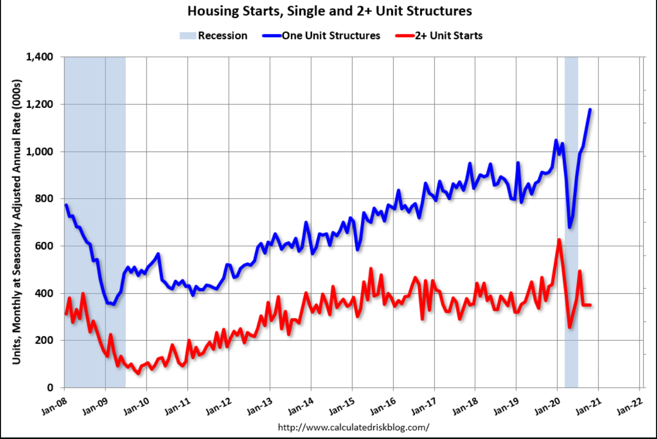
One unit starts are up but not enough to make up for the dip yet:
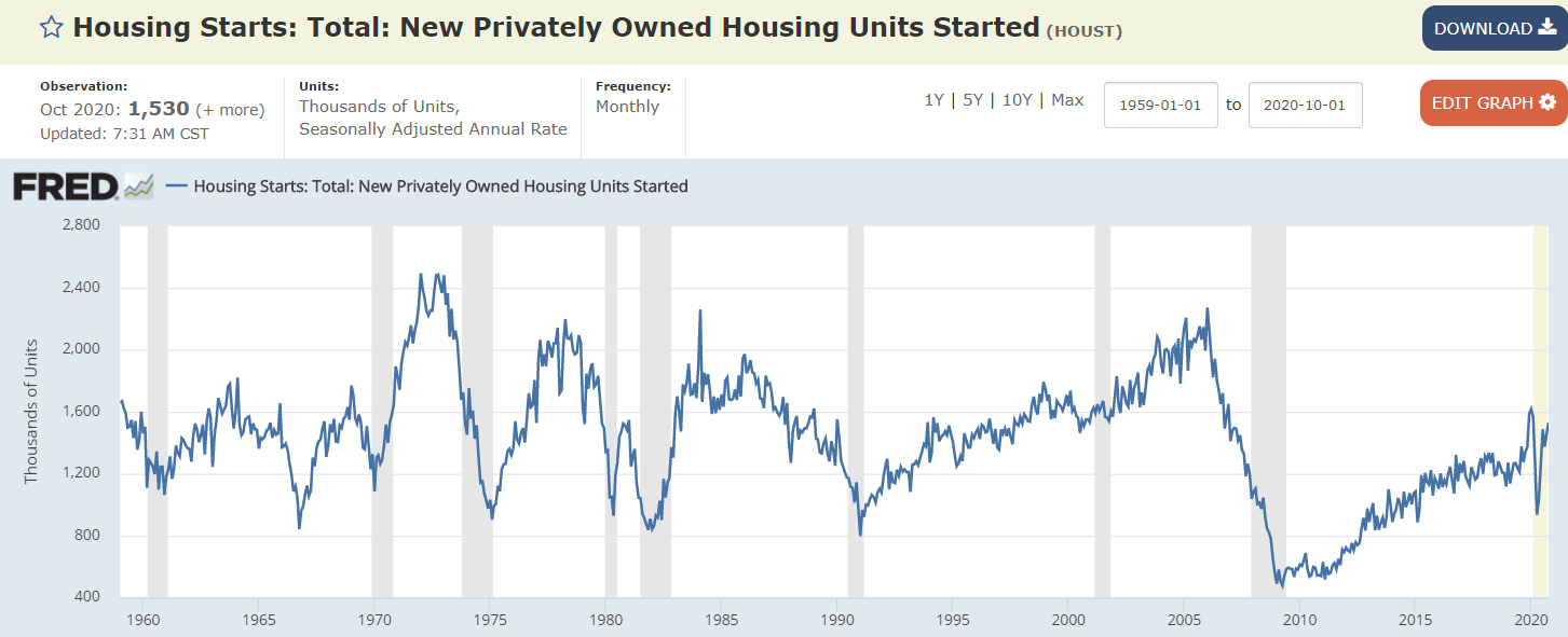
And housing remains historically depressed, and more so when factoring in population growth:
And lending growth has turned negative: