(email exchange)
Excellent summary of current conditions, thanks!
And gasoline consumption and inventories up year over year with a massive general output gap- so much for the presumed ‘demand destruction?’
q1 looking down 10%- and that’s with the government sector flat or maybe up some, so the rest is down that much more.
q3 forecasts now flat to up some as the fiscal adjustments unfold, including the ‘automatic stabilizers’ of falling revenues and rising transfer payments.
% gains from these levels will be dramatic without making all that much of dent in reducing the output gap.
Unless of course the mainstream reduces the output gap by declaring the natural rate of unemployment has gone up.
Like they always have in the past.
It’s all a staggering loss of real output and a larger loss in quality of life, with Congress fully responsible.
The current fiscal adjustment could have come right after it all went bad in July.
Clearly the 170 billion package last year ‘worked’ as q2 came in at over 2% real growth.
All they needed to do was do it each quarter.
That would have added up to about $700 billion per year and would probably have sustained at least modest levels of output and employment.
>
> On Sat, Feb 28, 2009 at 7:41 PM, Russell wrote:
>
February Economic Summary in Graphs
Feb 28 (Calculated Risk) — Here is a collection of 20 real estate and economic graphs from February …
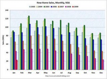
The first graph shows monthly new home sales (NSA – Not Seasonally Adjusted).
Note the Red column for January 2009. This is the lowest sales for January since the Census Bureau started tracking sales in 1963. (NSA, 23 thousand new homes were sold in January 2009).
From: Record Low New Home Sales in January
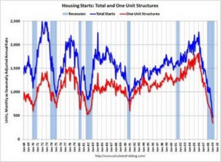
Total housing starts were at 464 thousand (SAAR) in January, by far the lowest level since the Census Bureau began tracking housing starts in 1959.
Single-family starts were at 347 thousand in January; also the lowest level ever recorded (since 1959).
From: Housing Starts at Another Record Low
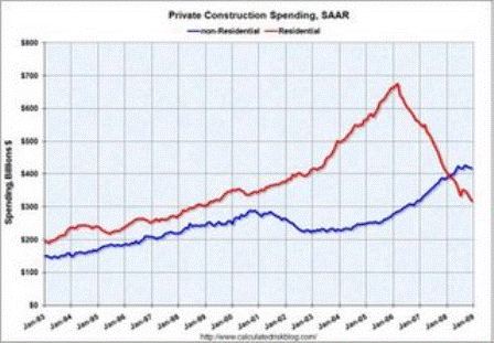
This graph shows private residential and nonresidential construction spending since 1993.
Residential construction spending is still declining, and now nonresidential spending has peaked and will probably decline sharply over the next 18 months.
From: Construction Spending: Private Nonresidential has Peaked
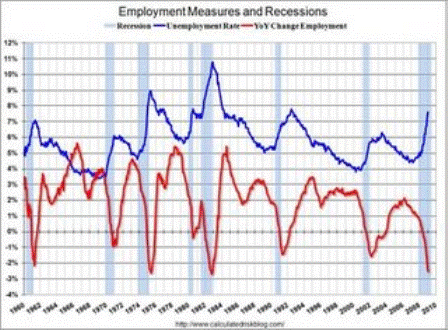
This graph shows the unemployment rate and the year over year change in employment vs. recessions.
Nonfarm payrolls decreased by 598,00 in January, and the annual revision reduced employment by another 311,000 in 2008. The economy has lost almost 2.5 million jobs over the last 5 months!
The unemployment rate rose to 7.6 percent; the highest level since June 1992.
Year over year employment is now strongly negative (there were 3.5 million fewer Americans employed in Jan 2008 than in Jan 2007).
From: January Employment Report: 598,000 Jobs Lost, Unemployment Rate 7.6%
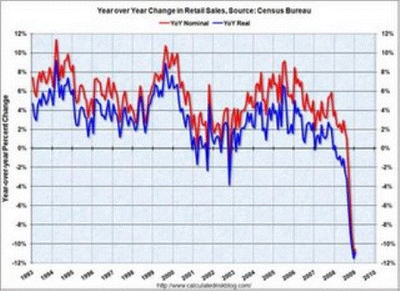
This graph shows the year-over-year change in nominal and real retail sales since 1993.
Although the Census Bureau reported that nominal retail sales decreased 10.6% year-over-year (retail and food services decreased 9.7%), real retail sales declined by 10.9% (on a YoY basis). The YoY change decreased slightly from last month.
From: Retail Sales Increase Slightly in January
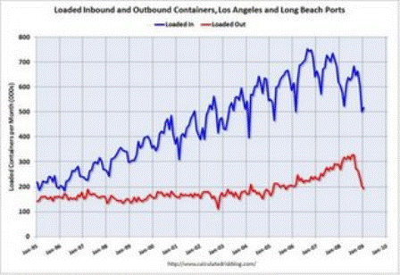
This graph shows the combined loaded inbound and outbound traffic at the ports of Long Beach and Los Angeles in TEUs (TEUs: 20-foot equivalent units or 20-foot-long cargo container).
Inbound traffic was 14% below last January. This slowdown in imports (inbound traffic to the U.S.) is hitting Asian countries hard. There was a slight increase from December to January, but that appears to be mostly seasonal (the data is NSA).
For the LA area ports, outbound traffic continued to decline in January, and was 28% below the level of January 2008. Export traffic is now at about the same level as in 2005.
From: LA Area Ports: Exports Decline in January
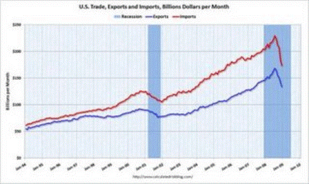
The first graph shows the monthly U.S. exports and imports in dollars through December 2008. The recent rapid decline in foreign trade continued in December. Note that a large portion of the decline in imports is related to the fall in oil prices – but not all.
From: U.S. Trade: Exports and Imports Decline Sharply
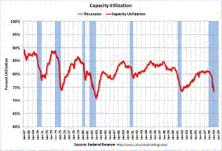
The Federal Reserve reported that industrial production fell 1.8 percent in January, and output in January was 10.0% below January 2008. The capacity utilization rate for total industry fell to 72.0%, the lowest level since 1983.
The significant decline in capacity utilization suggests less investment in non-residential structures for some time.
From: Capacity Utilization and Industrial Production Cliff Diving
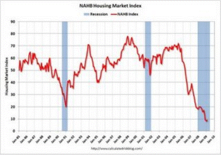
This graph shows the builder confidence index from the National Association of Home Builders (NAHB).
The housing market index (HMI) increased slightly to 9 in February from the record low of 8 set in January.
From: NAHB Housing Market Index Near Record Low
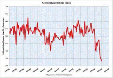
The American Institute of Architects (AIA) reported the January ABI rating was 33.3, down from the 34.1 mark in December (any score above 50 indicates an increase in billings).
From: Architecture Billings Index Hits Another Record Low
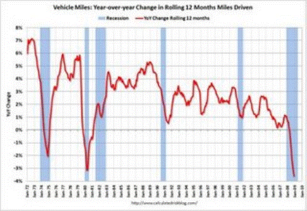
This graph shows the annual change in the rolling 12 month average of U.S. vehicles miles driven. Note: the rolling 12 month average is used to remove noise and seasonality.
By this measure, vehicle miles driven are off 3.6% Year-over-year (YoY); the decline in miles driven is worse than during the early ’70s and 1979-1980 oil crisis. As the DOT noted, miles driven in December 2008 were 1.6% less than December 2007, so the YoY change in the rolling average may start to increase.
From: U.S. Vehicle Miles Driven Off 3.6% in 2008
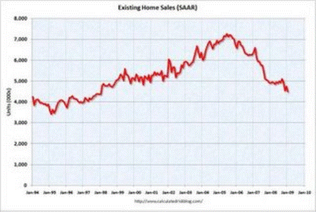
This graph shows existing home sales, on a Seasonally Adjusted Annual Rate (SAAR) basis since 1993.
Sales in January 2009 (4.49 million SAAR) were 5.4% lower than last month, and were 8.6% lower than January 2008 (4.91 million SAAR).
From: More on Existing Home Sales (and Graphs)
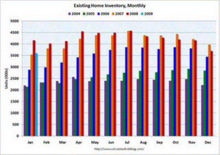
This graph shows inventory by month starting in 2004. Inventory levels were flat for years (during the bubble), but started increasing at the end of 2005.
Inventory levels increased sharply in 2006 and 2007, but have been close to 2007 levels for most of 2008. In fact inventory for the last five months was below the levels of last year. This might indicate that inventory levels are close to the peak for this cycle.
From: More on Existing Home Sales (and Graphs)
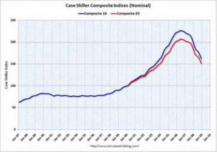
This graph shows the nominal Composite 10 and Composite 20 indices (the Composite 20 was started in January 2000).
The Composite 10 index is off 28.3% from the peak.
The Composite 20 index is off 27.0% from the peak.
From: Case-Shiller: House Prices Decline Sharply in December
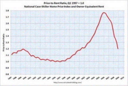
This graph shows the price to rent ratio (Q1 1997 = 1.0) for the Case-Shiller national Home Price Index. For rents, the national Owners’ Equivalent Rent from the BLS is used.
Looking at the price-to-rent ratio based on the Case-Shiller index, the adjustment in the price-to-rent ratio is probably 75% to 85% complete as of Q4 2008 on a national basis. This ratio will probably continue to decline.
However it now appears rents are falling too (although this is not showing up in the OER measure yet) and this will impact the price-to-rent ratio.
From: House Prices: Real Prices, Price-to-Rent, and Price-to-Income
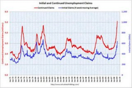
This graph shows weekly claims and continued claims since 1971.
The four week moving average is at 639,000 the highest since 1982.
Continued claims are now at 5.11 million – another new record (not adjusted for population) – above the previous all time peak of 4.71 million in 1982.
From: Weekly Claims: Continued Claims Over 5 Million
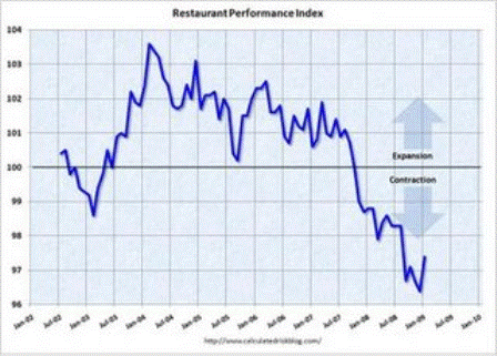
“The Association’s Restaurant Performance Index (RPI) – a monthly composite index that tracks the health of and outlook for the U.S. restaurant industry – stood at 97.4 in January, up 1.0 percent from December’s record low level of 96.4.”
From: Restaurant Performance Index Rebounds Slightly
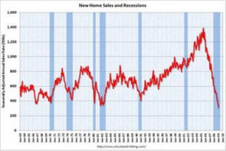
This graph shows New Home Sales vs. recessions for the last 45 years. New Home sales have fallen off a cliff.
From: Record Low New Home Sales in January
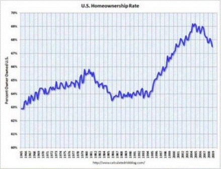
The homeownership rate decreased slightly to 67.5% and is now back to the levels of late 2000.
Note: graph starts at 60% to better show the change.
From: Q4: Homeownership Rate Declines to 2000 Level
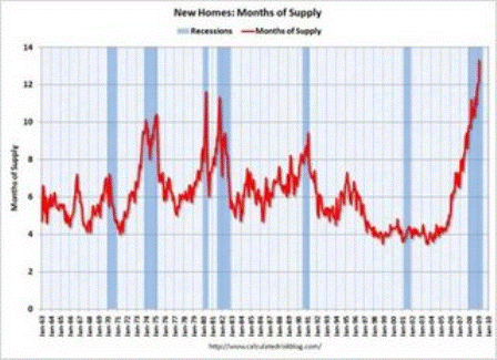
The months of supply is at an all time record 13.3 months in January.
From: Record Low New Home Sales in January
[top]

