Good chart.
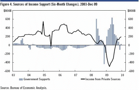
Note how the deficit as a % of GDP began trailing off midway through 06 and brought income from private sources (which for the most part are driven by private sector debt increases) down with it. And how the latest increase in deficit spending has begun to restore it.
As always, taxes function to regulate agg demand and, in fact, don’t actually raise revenue for the federal govt that never has nor doesn’t have any dollars.
It taxes by changing numbers down in our accounts and doesn’t actually get anything, and spends by changing numbers up in our accounts and doesn’t use up anything.
On Tue, Feb 23, 2010 at 9:59 AM, wrote:
Interesting chart from Citi Econ. 6mth rate of change in Income via Govt Support (essentially unemployment benefits, social security, medicare, etc) and Income from Private Sources (mostly wage and salary income, but also corp pension contributions, rental income, interest income, etc).


