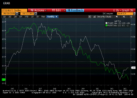
Interesting chart- inventory of existing homes for sale vs the labor force participation rate…
new home sales track closely as well…
;)
As we used to say, sometimes it’s all one piece…

Full size image

Interesting chart- inventory of existing homes for sale vs the labor force participation rate…
new home sales track closely as well…
;)
As we used to say, sometimes it’s all one piece…
